The placement of text and colours is very important in a magazine.
Typography
The placement of the masthead and the text and font is very important because it allows people to understand and interpret the feeling of a magazine.
Most front covers of magazines will use the font 'Sans Serif' for the masthead.
This is when there is not a little flick on the writing and the letters would have the strokes all even.Typography
The placement of the masthead and the text and font is very important because it allows people to understand and interpret the feeling of a magazine.
Most front covers of magazines will use the font 'Sans Serif' for the masthead.

Serif has the flicks coming off of the letters, giving it a more old fashioned feel. This type of writing is more likely to be used inside of a magazine rather than on the front cover, however sometimes magazines use it on the front in the masthead.


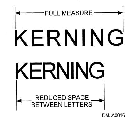
Kerning is the spaces between the letters, and they can be adjusted. For example, the writing could be spread more across a page by making the spaces between the letters bigger.
Some font types would be really bad to use as they are hard and unclear to read. Here are some examples:
TEXT
TEXT
TEXT
Whereas other texts are more easy to read. These would usually be used for mastheads, captions and just general texts inside a magazine or book. Here are some examples:
TEXT
TEXT
TEXT
These texts, although they might look similar, are very clear and would be good to read from a distance. The fonts which were used for the examples of bad fonts to use would be difficult to read from a distance and people would not know what the word said.
A good example of a clear font used on a masthead would be a vogue magazine.

If the font is on a coloured background, then the text must be written in a colour which shows clearly on the colour rather than clashing.

If you were going to use coloured text, you could not use green on top of blue for various reasons, such as people who are colourblind would not be able to read it. Also it would be very difficult to read and see anyway.
However using violet on yellow would work as it would be easy to see.

No comments:
Post a Comment